| Welcome guest. Sign In | New User Sign Up | Post Picture | Gallery |
Ink pics

|
Follow @rmipost 
|
Top 5 all time
| Shoulder Butterf | 9.59 |
| Lower back butte | 9.58 |
| Side boob Flower | 9.58 |
| Pubic Tigerfly T | 9.50 |
| Pubic Tigerfly | 8.97 |
All top tattoos

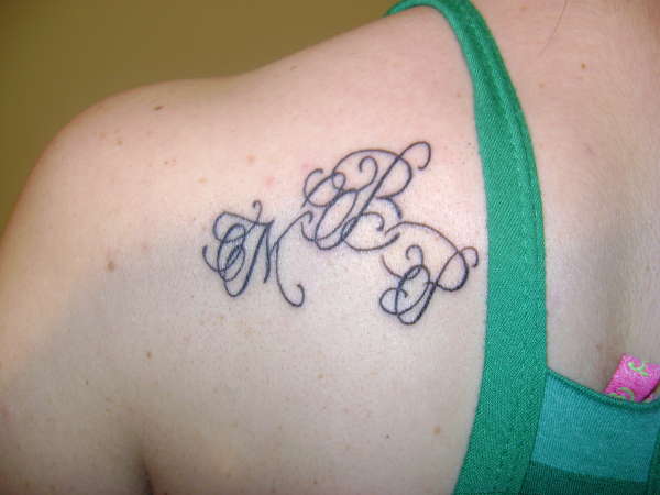
daughters initials |
||||||||
 |
||||||||
Tweet
 |
||||||||
| Use this link to share this picture http://www.ratemyink.com/?action=ssp&pid=79635 |
||||||||
|
||||||||
|
||||||||


| Signup | Login | Home | Gallery | Search | User Profiles | Help | About | Links |
| Privacy | TOU | Site Map | Contact |
| © 2014 ratemyink.com |