|
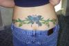
AMANDA |
2003-08-30 |
| the butterfly is alright ---but the rest is awful! |
 |
Stacey |
2003-08-27 |
| butterfly looks great, but the "stems, leaves, + daisies" look like a kid drew them |
|
Sixx |
2003-08-26 |
| great butterflies, sub par daisies...they need more detail... perhaps a darker green shadeing to make them more realistic? |
|
daelight17 |
2003-08-13 |
| I think it's a very cute tattoo, but it does look fake....and it's almost too over bearing. |
|
Amanda |
2003-08-05 |
| Sorry hunny but it looks generic!!!!! |
|
Spike |
2003-07-26 |
| Good thing SHE doesn't have to see it! ha! |
|
Spike |
2003-07-26 |
| I WAS talking about the Tattoo! It looks cheap...cracker-jack tattoos look better than this one. |
|
*~PeAcHeS~* |
2003-07-24 |
| People, you are here to rate the tattoo, not the person's body. Grow the fuck up. I think it's cool. |
|
Spike |
2003-07-20 |
| You should have gotten the BigMac.... Would have been cheaper unless you Super Sized it... |
|
yournamehere55 |
2003-07-19 |
| This is the worst tat ever. Coloring very poor. You had to have been drunk! |
|
Hulk5000 |
2003-07-18 |
| i like the butterfly |
|
Tat2dJNC |
2003-07-18 |
| People are so damn rude! Nice tat, looks great! |
|
Lookin4tattoodesigns |
2003-07-16 |
| i like the butterfly, but the vines are too big, they look like they would swallow the butterfly whole, sorry |
|
AMANDA |
2003-07-16 |
| The butterfly's look good-- but EVERYTHING ELSE don't-- |
|
cassandra |
2003-07-13 |
| every1 gets stretch marks sumtime in their lives its a very nice tat! |