|
Jen_&_Lynn |
2004-07-01 |
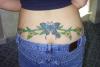
| nice STRETCH MARKS |
|
Coconut |
2004-05-14 |
| Not enough depth in the green. It needs more variety to liven it up. Go to another artist and add to it. |
|
Debbie |
2004-04-30 |
| butterfly's cool but the greenery is shit |
 |
Beth |
2004-04-29 |
| I like the butterfly but everything else about it sucks. I give a 5. |
|
matt |
2004-03-19 |
| DOES THE BUTTERFLY FLAP ITS WINGS WHEN YOUR ASSFAT JIGGLES? |
|
taybabe |
2004-02-09 |
| would be better looking if the viens went more up...then down... |
|
luv_tats |
2004-01-17 |
| I really like it! I like the butterflies with the flowers. Good job! |
|
Flamin Tattoo |
2004-01-07 |
| the blue butterfly would be nice on its own if it wern't pissed,vines...well...mmmm flat colour,too fat,shade? |
 |
allta2d |
2003-10-07 |
| the butterfly is awesome...the..vines...too thick, should be skinnier, and maybe the whole thing up higher! |
|
SUEDEHEAD666 |
2003-10-04 |
| That tattoo is great. If people want to look at asses they can go to a porn site... keep comments limited to tat critique! |
|
Jennifer |
2003-10-01 |
| that is super pretty! Love it a lot. |
|
Tweek |
2003-09-25 |
| its more like the huge of your ass. that looks like shit, i really hope you didn't pay too much for that. |
|
vicki |
2003-09-24 |
| eewwww stretch marks |
|
tiffany8949 |
2003-09-18 |
| The butterfly is ok but the vines are too much. It reminds me of a country style kitchen. |
|
anamarie72 |
2003-09-04 |
| The butterfly has great detail. I love the blue :o) |