|
![]() |

 <-back next->
1 to 7 of 7 comments
 |
Ian |
2008-02-17 |
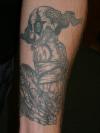
| dont really like the design. and the linework is just horrible, blowouts, shakiness, inconsistency. most of that will be an indescernible blob in 10 years |
 |
Ink2thebone |
2008-02-03 |
| unique design good work to |
 |
jessica |
2006-06-27 |
| sweet! |
|
April |
2006-03-17 |
| reminds me of my sister... cool tatt |
 |
TipTopTattoosRox |
2006-03-03 |
| cool tatt... needs more color though |
 |
gavin |
2005-12-06 |
| HAHAHHAHAA the artist captured his expression spot on! Good one =D |
 |
VampyrKyten |
2005-05-10 |
| very insane looking :) |
<-back next->
|
![]() |
|

