| Welcome guest. Sign In | New User Sign Up | Post Picture | Gallery |
Ink pics

|
Follow @rmipost 
|

 |
yoyo | 2011-03-07 |
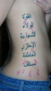
| strength , loyalty , courage ,respect, passion, independant (in this order) but nice :) | ||
 |
elijah | 2010-08-20 |
| yeah it does have an extra dot but i think its sexy i support anyone that chooses arabiya for there fonts its a beautiful language and has so many more meanings to a single word then english i can read and write it | ||
 |
ArabicCalligrapher | 2010-04-29 |
| Hey, I'm with Rani. All the words (except strength, with the extra dot) are spelled right, but computer based fonts in Arabic look stale to me. Sorry. Check out http://www.arabiccalligrapher.com/, all the work is hand-written with a reed pen. | ||
 |
patrick | 2009-10-13 |
| love arabic writing and that has to be the sexiest tattoo ive ever seen | ||
 |
Brian | 2009-10-12 |
| Cool tat - Great Body & you are Verrry Sexxxy!!! | ||
 |
Killbot | 2009-10-12 |
| Yeah. I, too, noticed the missing dots or whatever the hell...
No, I didn't. I just noticed some beautiful ink on a great form - and I'm not all that concerned about technicalities. |
||
|
Rani | 2009-10-12 |
| Strength has an extra dot on Laam.
Font is sandard "PC" font, I suppose it is still enjoyable by non-readers. Could have centered the words vertically. Still nice overall result 7/10. |
||
| Signup | Login | Home | Gallery | Search | User Profiles | Help | About | Links |
| Privacy | TOU | Site Map | Contact |
| © 2014 ratemyink.com |