|
BJensen |
2007-04-24 |
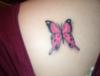
| I like the colors and while I don't think a tatt has to be perfectly symetrical, I do think (in this case) the right wing (as you look at the pic) could have used a little more shape/curve to it. Otherwise it's cool! |
 |
ilovetink |
2006-10-28 |
| I like it! Pink is my favorite color and I like the shadowing underneath. |
|
330ExGirlOrl |
2006-09-01 |
| Ah... I love pink ;) Could have been better though. |
 |
DTHW |
2006-08-27 |
.... change in gradation.Stop doing tattoos that are way above Your skill level. You are putting crap on people. However the lettering did look ok.
-DTHW |
|
DTHW |
2006-08-27 |
| to be symetrical. The artist was just lazy with the drawing. Oh yea addiction I see that You removed My critque on Your portrait yesterday, I guess I'll put it up here instead. The placement sucks, the faces look like cartoons, & there is no suttle..... |
|
DTHW |
2006-08-27 |
| That is the stupidest crap Ive ever heard. As an artist it is Your responsibility to make a tattoo that is supposed to be symetrical, symetrical. Just because saying that its not that way on real butterflys is retarded. This tattoo was clearly meant..... |
 |
www.addictiontattoo.com |
2006-08-26 |
| You have to consider that a real butterflies body is not even either! Even human bodies aren't! |
|
DTHW |
2006-08-26 |
A 2. The tattoo is uneven.
-DTHW |
 |
Michele |
2005-11-11 |
| I like this tattoo, and love the color! Very pretty |
|
Tag |
2005-08-14 |
| its nice should adee more to it tho |
 |
Mandy |
2005-07-27 |
| i like how vivid the hot pink is |
|
Maddy |
2005-07-18 |
| its not a flash tat but then again it probably looks like one because it is a butterfly and every second girl has one |
|
Maddy |
2005-06-17 |
| what the hell is a flash tattoo??? |
|
hothuni |
2005-05-04 |
| looks like a flash tat to me |
|
Maddy |
2005-04-23 |
| thanks!..this one should be better |