|
BlueEyedWolf |
2013-02-06 |
| Definitely doesn't deserve to be on bottom 10. The black work is nice and solid. I didn't even notice any problem with the black work. |
 |
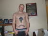
Levi Brown |
2009-06-29 |
| thank you everybody for the compliments and saying it doesnt deserve bottom 10 i like it fuck the haterss lol i have a new artist now doing my work and he is much better soo i will be posting way better work now |
 |
Mar |
2009-06-11 |
| I dont think this deserves bottom 10. Not my thing, but if it were just the word, minus the skull, that'd be kind of hot. Just sayin. |
 |
atom |
2009-06-11 |
| Personally, I would've gone a bit higher and bigger with the skull, but I bet that hurt like a bitch right there on your sternum. This definitely doesn't deserve bottom ten rating. |
 |
sloth |
2009-06-11 |
| is it me or is it crooked? |
 |
Heather |
2009-03-27 |
| I gave you a 1 simply because you used the word "prolly". LOL |