| Yahoo! Answers |
|
|
|
|
| Open Question: How bad does my tattoo look? |
|
It's a home tattoo, (big mistake)
I just wanted to know if i over criticize it or it's really shit.
I have others professionally done, this one's getting fixed soon. I just want honest opinions fro |
| 2013-08-03T06:22:44+0000 |
|
| Open Question: How bad does my tattoo look? |
|
http://tinypic.com/view.php?pic=izua37&s=5
http://tinypic.com/view.php?pic=2w562vr&s=5
And in my Avi are the only ones where I can find a decent looking shot of it.
It says with hope comes faith, |
| 2013-08-03T06:18:04+0000 |
|
|
![]() |

 <-back next->
1 to 8 of 8 comments
 |
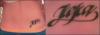
JaK |
2009-01-22 |
| The first K looks like a J...sorry. |
 |
drahc888 |
2008-02-02 |
| shitty tat..get a real tattoo. get a whole backpiece. |
 |
Sara |
2007-05-01 |
| Very original and a great placement! Love the fonts too! <3 |
 |
toxicandy |
2006-12-04 |
| I love the font and the thick lines :) |
 |
missfire |
2006-05-09 |
| Very nice.. I like the placement also and nice to see a different style of font... great! |
|
babymama |
2005-03-20 |
| nice place..unique. nice lettering style |
|
bow chicka bow bow |
2005-03-16 |
| i lovvvvvve this! so cute! so different! |
|
ashley |
2005-01-06 |
| post a better picture! its all blury and the lines are too thick |
<-back next->
|
![]() |
|

