| Welcome guest. Sign In | New User Sign Up | Post Picture | Gallery |
Ink pics

|
Follow @rmipost 
|

 |
borneoScorp | 2011-11-10 |
| Too good | ||
 |
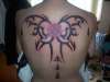
Brian | 2010-10-13 |
| The tribal design is not proportional. Also the edging of the downward spike on the left is bigger on the right. It would bother me. | ||
 |
Marcy | 2009-11-09 |
| oh wow i think its beautiful! | ||
 |
dan-yell | 2009-03-16 |
| i love it...kinda looks like a butterfly =] | ||
 |
noheiarchy | 2009-02-06 |
| i like it, however you have some space to cover, | ||
 |
pittbull08 | 2008-12-11 |
| I'm A tattooist and your work looks good for what I can see. You got alot of open spaces in the black but other than that looks good. It is hard to get solid in A tat that large, so take it slow when do'n hevy black.
Keep up the good work |
||
 |
tracy | 2008-12-03 |
| LOL, I was not going to use the symbol. I can picture someone coming up to me asking me who Ben is. | ||
 |
keith | 2008-12-03 |
| no problem tracy glad you like it, but the chinese symbol is for "Ben" the brothers name so you may need to change that bit | ||
|
tracy | 2008-12-02 |
| I love this!!!!!!!!!!
I keep coming back to this! I might have to steal it. I hope you don't mind. |
||
| Signup | Login | Home | Gallery | Search | User Profiles | Help | About | Links |
| Privacy | TOU | Site Map | Contact |
| © 2014 ratemyink.com |