|
Andrea |
2009-12-10 |
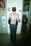
| I wish the butterflys were not connected, this would look good if they werent in some weird design like that. |
 |
Dan |
2009-01-08 |
| I love it, very original. |
 |
GTI |
2008-01-15 |
| i like it.... 8 |
 |
bootybug |
2007-08-30 |
| It reminds me of one of those connect the dots games. Sorry, the butterflies are pretty, but it looks disjointed to me. |
 |
lesley |
2006-08-29 |
| omg gorgeous but it must of hurt!!!ouch!!! |
 |
Ericka |
2005-07-06 |
| it would have looked 100% better with the butterflys by them selves.. i give it a 6 |
|
inkgirl |
2005-05-30 |
| theres just too many |
 |
VampyrKyten |
2005-04-13 |
| what's with the 8? individually, the tats look good. but over all it looks funky because there is no harmony to it. |
|
nonamepixie |
2005-01-18 |
| Once again, there's this thing called cropping. We don't need to see the shop in the background, just the tat. Which I'm not understanding either. Not saying it looks bad, just don't get it. |
|
daphne |
2004-07-24 |
| Great design! It's not something that u see everyday! |
|
Jennifer |
2004-05-26 |
| that is crazy, but i love it! must have taken forever to do! |
 |
jennifer <3 |
2004-03-25 |
| i don't understand the strange firgure 8 shape? |
|
hippychic96 |
2004-03-15 |
| very artsy! love it |
|
luv_tats |
2004-01-17 |
| Now that is different! Great job!!! |
|
eric |
2004-01-13 |
| That is beautifuuuuul! |