|
Ink2thebone |
2012-12-19 |
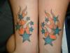
| i like the design but it seems kinda flat on your skin. it needs some detail to give it some depth. I also dig the colors |
 |
RATEMYINKADMIN |
2012-03-03 |
| Flames arent very original but the stars are A+++, new ideas are always a winner in my book. Keep up the good work, new idea thinker!!!! 6 stars from me winner!!! |
|
Rogue Agent |
2008-02-18 |
| cool idea but the flames could be better |
 |
matt |
2008-01-05 |
| you should add a second darker color to make the flames bette |
 |
Mayvis Buick |
2005-06-12 |
| Those are some horrible looking flames. |
|
Dream0n83 |
2005-05-19 |
| cute |
 |
ashley |
2005-02-28 |
| i really don't think the artsit was good. because the stars are un even. you should go get the flames touched up. the orange is fading... -3- |
 |
Karlsaves |
2005-02-26 |
| wow....you must like simple plan |
 |
jennifer <3 |
2005-02-20 |
| i really like it -- prob needs to be brightened |
 |
beccakiwi |
2005-01-29 |
| Kinda common |
|
Sarah |
2004-09-16 |
| i've seen it before Sorry! |
|
Missy_B |
2004-08-25 |
| The tattoo itself is great but one of the big stars on your left arm is really fucked up, try and something about it... |