|
![]() |

 <-back next->
1 to 6 of 6 comments
 |
Metropolis |
2008-09-06 |
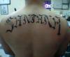
| a lot of these look like shit because the lettering is uniform, not centered, or just not artfully drawn. But your tat is an example of how to do it. Centered, symetrical(the larger font size, smaller, then larger again). Really excellent piece of art! |
 |
BoricuaMami |
2005-06-30 |
| That is nice work |
|
bow chicka bow bow |
2004-12-06 |
| yeah i would have to agree, that's hot! |
|
daphne |
2004-07-25 |
| Nice lettering! |
|
Jennifer |
2004-07-14 |
| Thats HOT!!!!! |
 |
DURANTE |
2004-07-13 |
| nice letter the fade looks sweet |
<-back next->
|
![]() |
|

