|
Lacey |
2008-05-25 |
| twin cities! dummies.... I dunno why its not MT?? that is odd...and i live in the cities..haha |
 |
mattyc |
2007-08-22 |
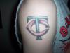
| the bottom of the T is definitely offline and the lines change in boldness. The shadowing is pretty good, but all in all it sucks donkey balls |
 |
BIFF |
2007-07-13 |
| twins are alright.. yankees are better ol.. uhh tattoo looks awsome and i like the lighter in the middle of the letter that looks sick.. what is it TC instead of MT?? |
 |
rays |
2007-04-22 |
| The “T” doesn’t line up at the bottom once it passes trough the “C” and the lines look unsteady. Dude if the stencil looks out of line, odds are that’s how it will transfer. The good news is, it’s an easy piece to cover-up |
 |
wikkedzak |
2006-01-18 |
| Not bad. I threw my White Sox tattoo up here so it's nice to see other people with team pride. |
|
INKINpink |
2005-05-04 |
| MY COUSINS HAVE THIS TAT ITS THERE INITIALS MAYBE YOU SHOULD FIND OUT WHERE THEY GOT THERES DONE .... |
 |
Elle |
2004-11-28 |
| to each their own... |
|
bow chicka bow bow |
2004-10-12 |
| GO MINNESOTA!!!! but the twinkies suck right now :( |
|
redneck |
2004-09-14 |
| C T stands for cheap tattoo! |
|
KiiDSarajevo |
2004-06-30 |
| good! im glad im not the only person on here to display their love for their baseball team! |