|
![]() |

 <-back next->
1 to 12 of 12 comments
 |
archerxue |
2008-02-07 |
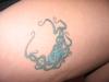
| cool octopus tattoo |
 |
Princess Desiree |
2007-03-09 |
| Pez, if you dont like any of the tats on this site, why are you still here??? |
 |
Pez |
2005-09-07 |
| All I see is fat |
 |
guiltysamurai |
2005-08-16 |
| might look better if it was recolored...fine line tats can blend over time if not done with the rght inks... |
 |
daniel |
2004-12-22 |
| looks like spooge |
|
pebbles |
2004-11-05 |
| snooze |
|
Ethan |
2004-10-27 |
| People are so harsh sometimes. Love the idea, but I'm thinking placement might have swayed the jury on this site... |
 |
InkSlave666 |
2004-10-11 |
| the color work is boring ...no color blends or anything |
|
Buff n Tuff |
2004-08-24 |
| that bap is humungous |
|
good by rate my ink |
2004-07-19 |
| crap... |
|
larry |
2004-07-10 |
| looks like a whole bunch of scribbly blue lines to me |
|
sarah |
2004-06-02 |
| sorry but i dont like it |
<-back next->
|
![]() |
|

