| Yahoo! Answers |
|
|
|
|
| Open Question: How bad does my tattoo look? |
|
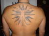
It's a home tattoo, (big mistake)
I just wanted to know if i over criticize it or it's really shit.
I have others professionally done, this one's getting fixed soon. I just want honest opinions fro |
| 2013-08-03T06:22:44+0000 |
|
| Open Question: How bad does my tattoo look? |
|
http://tinypic.com/view.php?pic=izua37&s=5
http://tinypic.com/view.php?pic=2w562vr&s=5
And in my Avi are the only ones where I can find a decent looking shot of it.
It says with hope comes faith, |
| 2013-08-03T06:18:04+0000 |
|
|
![]() |

 <-back next->
1 to 7 of 7 comments
 |
emily |
2009-05-29 |
| TERRIBLE proportions on the legs. they look sooo unnatural. sorry :( |
 |
kamusto |
2009-01-15 |
| the leg is posed to be a lil bent from lookin at the original pic |
 |
adikted2ink |
2008-08-26 |
| thats not a muscle flex or shading or the angle of the pic..its fucked up |
 |
matt |
2008-01-03 |
| haha - you got defensive for this piece of shit - have you even looked at the original virtuvian man?!?! |
 |
Mandee |
2007-10-22 |
| i dont know who would travel for that kind of work. nice concept, poorly executed. i agree that leg looks broken & its definitely not because of the muscle. actually both of the middle legs looks jacked up! sorry dude |
 |
easy_lsm |
2007-09-06 |
Hi Amy,
If you was aware of the human anatomy then you would realise that the picture is taken not at the best angle and because of the muscle form, creates the appearance of the 'broken leg'.
I will post another picture. |
|
Amy |
2007-08-29 |
| his right leg looks like it's broken, I hope people aren't traveling far...doesn't look worth it |
<-back next->
|
![]() |
|

