|
daniel_kinnane |
2009-09-15 |
| lol it looks like a target for guys to aim |
 |
Tattoo Tim |
2008-06-08 |
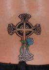
| clean and simple.you cant go wrong with across for your first tat. |
 |
Rocco Stagz |
2007-06-08 |
| very nice. like the rose |
 |
Nome |
2007-02-04 |
| I disagree, I think the rose adds a much needed hint of colour and that's fine. |
|
Pazz16 |
2006-06-27 |
| yeah the rose does throw it off. but maybe you could add more so then the cross will look like it is in a bed of roses. |
 |
md22 |
2006-01-06 |
| Love it!! |
 |
Lone Star |
2004-11-12 |
| its nice but the rose throws it off. |
|
PirateTink |
2004-11-05 |
| It would look better without the rose, but the cross is pretty rockin' |
 |
Klubn |
2004-09-05 |
| Still, it's nice. |
|
appstateisdoodoo |
2004-02-09 |
| wow. that's all I could think of. wow |
|
Kerri |
2004-02-01 |
| Nice!! 10 |
|
good by rate my ink |
2004-01-24 |
| nice, looks kind of crooked at the bottom of the cross??? |
|
dradja |
2004-01-22 |
| love it! 10!!!! |
|
Funkin Punkin |
2004-01-15 |
| That is probably one of the best crosses I have seen on this site. Great work. |
|
disturbedchic |
2003-12-21 |
| That's very pretty. I give you a 10 :) |