|
sex & candy |
2008-05-23 |
| the body and tail dont work well together... the placement is nice. you guyz are being too hard...at least she tried to cover the boobie and shaved the pit |
 |
ChandaMija |
2006-11-19 |
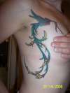
The Phoenix tail and the Sparrow's body isn't coordinated... It's BENT!
Otherwise, I like the Cancer. You should edit your photo to look like mine, whited out around the tat so people can't see where the tattoo is or any body parts of mine.
Moron |
 |
yankees suck! |
2006-11-02 |
| Hummingbird??? I'm thinking more of a phoenix/woodpecker/made up bird |
 |
wikkedzak |
2006-10-25 |
| I could tell ya why. Cuz it shows some side tittay... Yeah I'm not impressed either. |
 |
TommiCrazy |
2006-09-20 |
| great place for tattoo but i dont like the colors, someone should spend more time for it |
|
aaron |
2006-08-12 |
| I like I like!!!!!!!!!!!!!!!!!!!original design great color!!!!!!!the only placement problem is your hand, I wish it wasn't there so I could get full impact of beauty!!!!!!!! |
 |
rayla |
2006-08-11 |
| beautiful colors, great placement! i have one similar to this on my back, i like how you incorporated the pink ribbon :-) |
|
Jecca |
2006-07-30 |
| This is beautiful! I agree with the other person, I think that it looks more like a phoenix than a hummingbird, but it's absolutely fantastic and the fact that it has so much meaning makes it that much more special : ) |
 |
Mike A |
2006-07-28 |
| even thought i'm a dude, i'll still have your kid...very nice work/tat |
|
Alainnre |
2006-07-24 |
| This is the exact tattoo I've been planning to get for a while, but I want different colors and for it to be closer to the breast. At least I know other people like it! Looks great, love the personal touch of the ribbon. |
 |
DanT |
2006-07-24 |
| Good lines. Solid colors. Looks nice but really doesnt look like a hummingbird. |
 |
FLAMMABLE F. PUMPS |
2006-07-17 |
| i agree with the statement below. very nice!!! |
|
beerismyfriend247 |
2006-07-16 |
| Nice colors, very nice placement, i wanna see more! ;) |
 |
Lisa |
2006-07-15 |
| I love it, that for sure gets a 10, the placement is great too. Very nice! |