|
CueBall |
2012-12-06 |
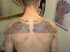
| Really can't knock the work but he should of asked for the wings to flow down his back, that just makes him look like that guy from epic movie |
 |
Hannibal |
2009-09-14 |
| The work is good but the design is poor. They just look flat and plonked on. Even though I don't like wings I can appreciate that the better examples flow with the shape of the back. These are just rigid. |
 |
Johnny Wrath |
2009-01-15 |
| Put some soap on that rag. |
|
J_Robert |
2007-09-01 |
| Something missing, not sure what -- but need more. |
|
suzy |
2007-08-30 |
| The wings are done well, but as everyone else says put something between them |
|
needlework |
2007-02-13 |
| that tat is stupid and unoriginal... but the work is half decent. |
|
knifepoint |
2007-01-12 |
that looks f$$king stupid :(
I'd shoot you if you were a family member of mine |
 |
brandimonkey |
2006-12-30 |
| they look good but they should be bigger... it doesn't seem like you would be able to fly with those wings. but they look nice. |
|
shannon johnston |
2006-10-29 |
| I like them, even with nothing between them |
 |
trudy |
2006-09-24 |
| ur wings r nice but r u putting some thing between them |