|
BoxyBabe |
2009-03-10 |
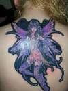
| This is a really cool tat...though I would've suggested to do a black with a fade to dark gray around her |
 |
fister07 |
2008-12-18 |
| I have to agree with nesgaard but I still give a 10 because of it being that nice. |
 |
Cav |
2008-06-25 |
| To be proud off,Excellent. |
 |
nesgaard |
2008-06-22 |
| Looks good - however I would've definately have preferred to see the black only following the outlines - would've had the same effect colorwise. |
|
carrie |
2008-05-01 |
| Holy crap! That is awesome! "10" |
 |
Jodi |
2007-09-27 |
| WOW!!! The colors are so intense...I LOVE IT! |
 |
vietnamdom |
2007-07-30 |
| color and design are perfect |
|
Tiffanii |
2007-07-29 |
| That is soo beautiful! |
 |
SithLord666 |
2007-07-26 |
| The best way to bring out the colors is with a dark background, so i think all the black is really neccesary, even though it might seem a little harsh...other than windbars, cant think of what else could have been done. Great piece of art! |
|
amanda |
2007-06-04 |
| an absolutely beautiful tattoo. xxxx |
 |
kastat |
2007-04-27 |
| i like the black in it, good job |
|
BJensen |
2007-04-13 |
| Nice but too much black laced thru it. |
|
Ink_Girl85 |
2007-03-24 |
| i agree it does look like a sticker. I would have liked it much better with out the black. but over all a seriously beautiful piece. |
 |
John |
2006-11-12 |
| I love the detail and color in the fairy.... |
 |
QueenT |
2006-11-10 |
| thats alot of black....it kind of looks like those 1980s iron on things you put on clothes...pretty colors tho...-6- |