| Yahoo! Answers |
|
|
|
|
| Open Question: How bad does my tattoo look? |
|
It's a home tattoo, (big mistake)
I just wanted to know if i over criticize it or it's really shit.
I have others professionally done, this one's getting fixed soon. I just want honest opinions fro |
| 2013-08-03T06:22:44+0000 |
|
| Open Question: How bad does my tattoo look? |
|
http://tinypic.com/view.php?pic=izua37&s=5
http://tinypic.com/view.php?pic=2w562vr&s=5
And in my Avi are the only ones where I can find a decent looking shot of it.
It says with hope comes faith, |
| 2013-08-03T06:18:04+0000 |
|
|
![]() |

 <-back next->
1 to 8 of 8 comments
 |
warriorpudding |
2014-04-13 |
| ps thanks for your comment! I've posted up a clearer pic of the fairy you asked about... |
|
warriorpudding |
2014-04-13 |
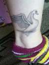
| Lovely swan - I like the way it looks as though it were drawn softly in pencil, rather than harsh black outlines. |
 |
Martyna TineX |
2014-04-13 |
| These are my moles. Unfortunate placing ;p |
 |
Brian |
2014-04-13 |
| I See a Few Spots on the Wing,Closer To The Left |
 |
Steeleagle |
2014-04-05 |
| As I stated on your other pic..... love everything this swan represents. Great first tat! |
|
Martyna TineX |
2014-04-01 |
| Look up the link to the first version, it's better quality. |
|
Martyna TineX |
2014-04-01 |
| I don't think it has blow-outs, the picture is just blurry, I will try to post a better one later. What do you think of general design? |
|
Brian |
2014-04-01 |
| Shading is Pretty Good,Looks Like a Few Blow Out's on the Line Work, Not a Bad Tat Though |
<-back next->
|
![]() |
|

