|
Jason |
2007-05-07 |
| I agree, with a little colour this would look great. I still like it as it is though.. |
 |
Vampsy |
2007-04-01 |
| I don't think it looks too bad man. I'm only an amateur with tattoos and that...I don't even have one yet lol...but I think it looks nice. Would look better with more shading and some colour though. |
|
Carol |
2006-08-19 |
| My six year old niece can draw better than that. |
|
cara |
2006-03-22 |
| I agree it needs more color.. but i love the idea of it |
|
Buff n Tuff |
2004-09-03 |
| that's one fucked up plant, growin heads 'n shit. |
|
redneckpunk |
2004-08-14 |
| Shaiding is very light not enough contrast. Needs some more grey and black pulled through it to make it pop. |
|
gsenteno |
2004-03-08 |
| It's a cool idea |
|
brimstone ink works |
2004-01-20 |
| in ma. check out the web site @www.brimstoneinkworks.com....thanx... jaxx |
|
Courtney |
2004-01-04 |
| Sweet Idea . Great work ! Where is the shop located at ? |
|
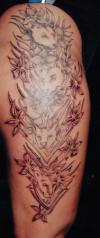
brimstone ink works |
2003-09-04 |
| each cub represents a child or grandchild.....this was her 1st tattoo |
|
Justine |
2003-08-27 |
| Sweet!! that is really beautiful |