| Welcome guest. Sign In | New User Sign Up | Post Picture | Gallery |
Ink pics

|
Follow @rmipost 
|

 |
tracyb | 2010-08-04 |
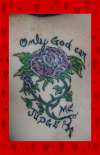
| would look better if the script was consistent. Either all cursive or all print. | ||
 |
inks babe | 2009-08-19 |
| the n in only looks like a m. i would good have that fixed | ||
 |
anette | 2009-06-04 |
| I like the style of this.
Too bad about the cursive n. It's pretty in any case |
||
 |
Margot | 2008-07-08 |
| Om-ly? Are you Hindu? | ||
 |
Funker-a | 2008-06-29 |
| LAME! | ||
|
Skream! | 2008-03-06 |
| Cheesy. | ||
 |
Jesse | 2007-11-04 |
| "Only" is the only word written in cursive, and a cursive "n" looks like a printed "m" genius.
Anyway, it does seem odd to put a tat on a site to be judged when the tat says only god can judge you. |
||
|
TheTruthHurts | 2007-09-22 |
| looks like its says 'omly' not only..
doh |
||
 |
HannahElphaba | 2007-03-19 |
| i think this tattoo is ok for you. but LOLOLOL at this: "Wrong. I can actually judge you, too. I think you are pretty stupid. And god does too.
He told me." |
||
|
Chris | 2006-09-26 |
| LOL Super Const. I not judging you. I judging your tat and your artist. The tat sucks. The idea's good, and the writing is good. The rose blows. | ||
|
Giligadi | 2006-07-30 |
| Wrong. I can actually judge you, too. I think you are pretty stupid. And god does too.
He told me. |
||
 |
Sioux | 2006-03-07 |
| Thats pretty, but there could have been some more effort to your rose. Otherwise yeah thats pretty. | ||
|
WombFruit | 2006-02-10 |
| Love it. and the tiny detail. The lettering goes perfect with piece in placement and style. | ||
|
i rate you | 2005-12-02 |
| and me...6 | ||
 |
Blade Dancer | 2005-10-31 |
| despite the stupid comments, the tat is awesome, with a very true message... the font is neat, i like the thorn-like look to it | ||
| Signup | Login | Home | Gallery | Search | User Profiles | Help | About | Links |
| Privacy | TOU | Site Map | Contact |
| © 2014 ratemyink.com |