|
Alex |
2010-05-23 |
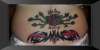
| I dont think there's any need for nasty comments towards the person themselves, i think there is far too much dark on the tattoo and on a girl dont think that looks right but lets remember we all have our own taste eh |
 |
Ink |
2008-11-15 |
| wow why not just brand your self "slut" |
|
tatlover |
2008-09-19 |
| sorry, I agree, bit too much and too dark. why not just take a crayon and scribble all over yourself??? |
 |
chipper*e |
2008-07-30 |
| In all due respect, it looks like an advertisement for the dirtiest trailer park in town. |
 |
maria |
2008-06-18 |
| the roses a definate thumbs up, nice work but not together, artist shoulda really advised against it... |
 |
Lacey |
2008-05-25 |
| one or the other..please..looks bad. double tramp! lol |
 |
Will |
2008-03-31 |
| It looks like two back pieces fighting for the same spot. Sorry reily don't like the placement. I do like the roses. |
 |
tattoosbykizzle |
2008-01-13 |
| Bad and worse...together |
 |
deanna |
2007-02-23 |
| those two designs shouldnt have ever been stacked like that.. not good.. whats done is done though.. from now on be careful and let the artist do the work and tell you what will and wont work.. if they told you that this was a good idea, they were drunk |
 |
darth_nippy |
2006-07-18 |
| i hate to say bad shit about tats but this looks bad |
 |
Pegasus |
2006-01-27 |
| should not have put one on top of the other like that |
 |
Sodajerk |
2005-11-23 |
| I like ! |
 |
Blade Dancer |
2005-10-31 |
| beautiful! i especially love the colours on the bottom one :-) |