| Yahoo! Answers |
|
|
|
|
| Open Question: How bad does my tattoo look? |
|
It's a home tattoo, (big mistake)
I just wanted to know if i over criticize it or it's really shit.
I have others professionally done, this one's getting fixed soon. I just want honest opinions fro |
| 2013-08-03T06:22:44+0000 |
|
| Open Question: How bad does my tattoo look? |
|
http://tinypic.com/view.php?pic=izua37&s=5
http://tinypic.com/view.php?pic=2w562vr&s=5
And in my Avi are the only ones where I can find a decent looking shot of it.
It says with hope comes faith, |
| 2013-08-03T06:18:04+0000 |
|
|
![]() |

 <-back next->
1 to 6 of 6 comments
 |
Becca |
2010-03-08 |
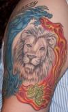
| the black and gray of the lion and vivid color of the dragon doesn't mix well. I think the lion should be colored in. both are solid on their own but together it seems off. |
|
tiny |
2007-07-08 |
| what the hell is going on with all this tiger and lion shit.guys,if your using your ink to try to prove your a bad ass,try not putting a cat on yourself,but it is great work though,no disrespect.just not a fan of kitties with additude |
 |
gavin |
2007-02-10 |
| Art work is good, design is a bit off.. i mean they dont go together.. the lion head is bigger than ur dragon.but im sure it means something to you. |
 |
erica |
2006-10-24 |
| it would be good if you got the lion colored in. -7- |
 |
Aurah |
2006-08-24 |
| Looks like the dragon was added after the lion.... the two dont really go together.. seems out of place. |
|
Frenchy |
2006-07-21 |
| I like the mix of color and black & white, and I like the style of the lion. |
<-back next->
|
![]() |
|

