|
Zinger |
2008-06-10 |
| nice |
 |
Champions of Europe 08 |
2008-03-12 |
| weak.... could of been a lot better, nice concept though |
|
That dude |
2007-04-16 |
| Awesome concept...but could have looked a lot better |
|
Dean |
2007-03-31 |
| Love the concept, I would have left the horn off the angelic side! Just me though! |
 |
trick daddy |
2006-07-15 |
| take the horn off the angel and get the face fixed could you not afford more ink?? but good idea |
 |
Marissa |
2006-03-25 |
| I love it very nice |
 |
HollowDays |
2005-09-07 |
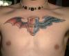
nice colorwork but really wierd looking, it kinda makes me feel like crying, on the inside.
good on you though for designing it. |
|
BonnyBoo |
2005-06-14 |
| Yeah I'd have to say similar, I love the wings, but the face lucked out just a little, it has a bit of a gormless look on the face and the eyes look a bit weird. |
 |
Big L |
2005-03-02 |
| looks really nice! |
|
Moose25 |
2005-03-02 |
| Nice wings but the face is bland. |
|
slim jim |
2005-02-04 |
| its self drawn and it shows. crap |
|
jason |
2005-01-29 |
| i agree with bow the angel shoulda been without horn and red eye |
 |
nick3538 |
2004-12-24 |
| neat |
 |
DeeJayUdders |
2004-12-05 |
| If it's self drawn.. It should be however he wants. I love it, looks great.. Especially for being self drawn. I've fallen in love with your tattoos. |
|
martin* |
2004-12-01 |
| You ahve got some great ink!!! |